【Python】matplotlibでヒストグラム作成(まとめ)
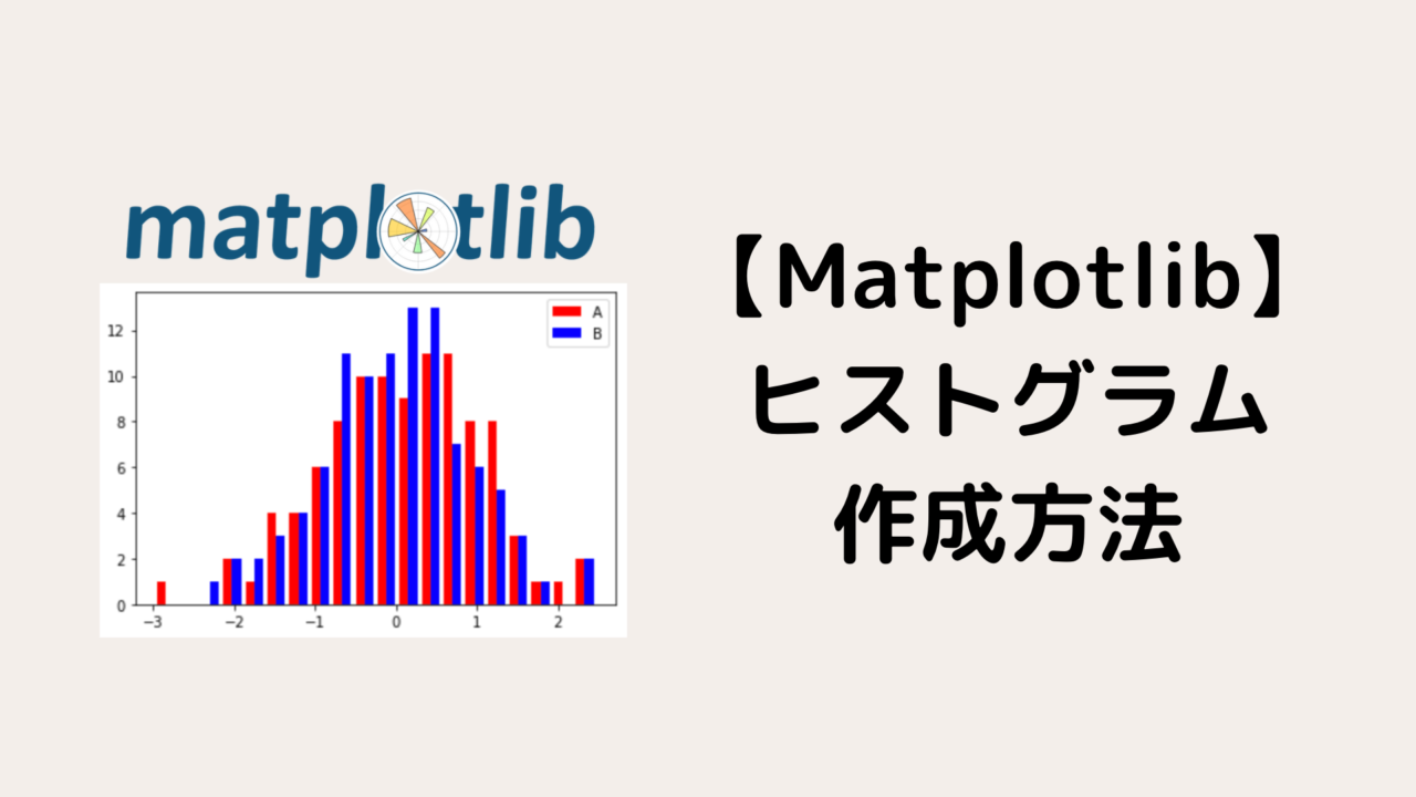
【Python】matplotlibでヒストグラム作成(まとめ)
本記事では、Pythonのmatplotlibというライブラリを利用して、ヒストグラムを作成する方法を紹介します。
カスタマイズ方法についても詳しく説明するので参考にしてください。
Pythonでグラフをプロットしたことがない方は先に下記を参考にしてから本記事を読んでください。

ヒストグラムを作成する準備

ヒストグラムを作成するために、まずは以下のライブラリをインポートしてください。
import matplotlib.pyplot as plt
import numpy as np
import pandas as pd
pandasは、サンプルデータを見やすくするために使用しました。
Pythonでヒストグラムを作成する方法

本記事では、matplotlibのAxes.hist()を利用してヒストグラムを作成していきます。
まずは、引数を簡単にまとめておきます。
| 引数 | 説明 |
|---|---|
| bins | ヒストグラムの柱の数(デフォルトは10本) |
| range | 対象範囲を(float, float)で指定 |
| density | Trueにするとヒストグラムの面積が1になるように正規化される(具体例は後述) |
| cumulative | Trueにするとグラフが累積分布になる |
| histtype |
ヒストグラムの種類
|
| align |
柱の位置
|
| orientation |
ヒストグラムの向き
|
| color | 柱の色(リストで指定可) |
| label | ラベル(リストで指定可) |
| facecolor(fc) | 柱の色(リストで指定不可) |
| alpha | 透明度を0〜1で指定 |
| linewidth(lw) | 柱の縁の太さ |
| edgecolor(ec) | 柱の縁の色 |
この段階で全ての引数を覚える必要はありません。
このあと主要なものは具体例を使って説明するので安心してください!!
また、Axes.hist()には以下の三つの戻り値があります。
- 第一返り値 : 各階級の度数(各柱の高さ)
- 第二返り値 : 各階級の区間
- 第三返り値 : Patchオブジェクトのリスト
今回、使用するサンプルデータを作成しましょう。
df = pd.DataFrame(data=np.random.randn(100, 3), columns=['A', 'B', 'C'])
df.head()
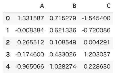 最初の5行まで表示
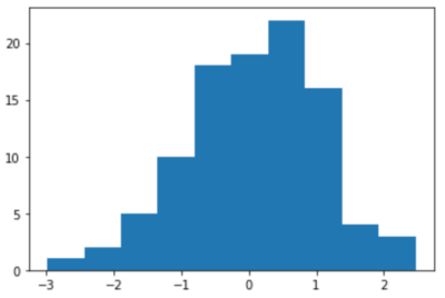
簡単なヒストグラムを作ってみる
まずは、最もシンプルなヒストグラムを作成してみましょう。
fig, ax = plt.subplots()
ax.hist(df['A'])
plt.show()
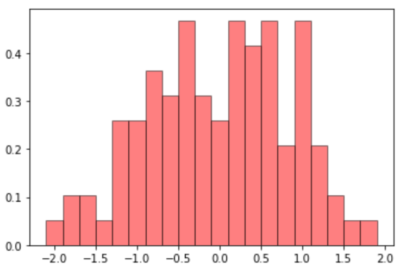
ヒストグラムをカスタマイズしてみよう
次に、引数を指定してヒストグラムをカスタマイズしてみましょう。
fig, ax = plt.subplots()
ax.hist(df['A'], bins=20, range=(-2.0, 2.0), density=True, align='left',
        fc='r', lw=1.0, ec='k', alpha=0.5)
plt.show()
次は、複数のデータをヒストグラムで表示する方法を紹介していきます。
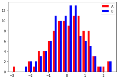
複数のデータをヒストグラムで表示する

ここからは、複数のデータをヒストグラムに表示する方法を紹介していきます。
横に並べて複数のデータをヒストグラムで表示する
横に並べて複数のデータをヒストグラムで表示する例を紹介します。
fig, ax = plt.subplots()
ax.hist([df['A'], df['B']], bins=20, label=['A', 'B'], color=['r', 'b'])
ax.legend()
plt.show()
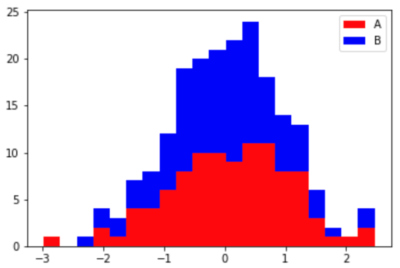
縦に積み重ねて複数のデータをヒストグラムで表示する
縦に積み重ねて複数のデータをヒストグラムで表示する際は、引数histtype='barstacke'と設定しましょう。
fig, ax = plt.subplots()
ax.hist([df['A'], df['B']], bins=20, label=['A', 'B'], color=['r', 'b'], histtype='barstacked')
ax.legend()
plt.show()
まとめ
本記事では、pythonのmatplotlibを利用してヒストグラムを作成する方法を紹介しました。
基本的には、本記事で紹介したカスタマイズ方法を利用して所望のヒストグラムが作成できると思います。
ぜひ、本記事を参考にしてデータ解析・研究に生かしてください。
Pythonによる可視化方法をより詳しく知りたい方は下記を参考にしてください。
Pythonを学習するのに効率的なサービスを紹介していきます。
まず最初におすすめするのは、Udemyです。
Udemyは、Pythonに特化した授業がたくさんあり、どの授業も良質です。
また、セール中は1500円定義で利用することができ、コスパも最強です。
下記の記事では、実際に私が15個以上の講義を受講して特におすすめだった講義を紹介しています。

他のPythonに特化したオンライン・オフラインスクールも下記の記事でまとめています。
自分の学習スタイルに合わせて最適なものを選びましょう。
また、私がPythonを学ぶ際に使用した本を全て暴露しているので参考にしてください。